An Interview with Øyvind Torseter

Øyvind Torseter
July 22, 2018
We interviewed Øyvind Torseter, acclaimed children's book illustrator, author and comic book artist. He was the 2014 finalist for the biennial, international Hans Christian Andersen Award. In 2008 he was honored with the Bologna Ragazzi Award. He lives and works in Oslo, Norway.
When illustrating a book written by another author, My Father's Arms Are a Boat for example, how do you typically conduct that collaboration? Are there any phone conversations or face-to-face meetings or is the connection between the two of you all done through your editor? Do you have a preference?
The illustrator is usually contacted by the editor of the publishing house. The author sends the manuscript to the publishing houses and if it is accepted the editor and the author start to look at different illustrators work to see what could suit the story. Sometimes an illustrator and an author develop a project together and then go to the publisher but that is more rare.
Cover of My Father's Arms Are a Boat by Stein Erik Lunde, illustration by Øyvind Torseter
The editor for My Fathers Arms Are a Boat asked me to read the manuscript at an early stage. And I liked the story very much! It was good to see the text at a early stage because that gave a lot of room for the illustrations and working with text and image simultaneously. Also, the author's, Stein Erik Lunde, writing was very minimal and had few descriptions. That is often good for picture books.
Interior spread from My Father’s Arms Are a Boat, by Stein Erik Lunde, illustration by Øyvind Torseter
I made a quick storyboard and met up with the author and the editor. The author made some changes in the text and I did some changes in the storyboard. We wanted to make a book where text and image was merged together, but also where text and image could tell the story a bit differently.
Interior spread from My Father’s Arms Are a Boat, by Stein Erik Lunde, illustration by Øyvind Torseter
A lot of the text is a conversation between a father and his son. I thought it could be interesting to make a visual story inside the story. So I made a red fox wandering around outside in the snowy winter night while the two are talking. I thought this would be more interesting than showing the two of them speaking. Later in the book the visual story about the fox and the text meets, where the father takes his son out to look at the stars in the night.
We had maybe three or four face-to-face meetings. Also some emailing, sending new versions of images and text to each other.
I think this is my preferable and favorite way of making picture books together with authors. Where both text and image can change until the end and where we don't know the end result. Then author and illustrator can create something together that is more than the sum of two parts.
When creating illustrations for a book, do you know where the page breaks are already, as determined by that author, or do you have some input into this decision? How does that impact your process?
Usually the author have indicated page breaks. But often we have to change this because the dynamic changes when the pictures are added. I think the breaks between pages are very important in picture books. That there is a rhythm but also that it can be used to surprise or change mood.
Interior spread from My Father’s Arms Are a Boat, by Stein Erik Lunde, illustration by Øyvind Torseter
Your use of color is important to your style, whether it is to evoke a particular mood (the red used on the pages where there is firelight) or in a restrained way where only one element (the fox) is in color and the rest is in subdued hues. Can you talk about your process?
Since I am a drawer, line drawing is most important for me. I think in line. Colour is number two. For a painter, color would be number one. When I use color it often has a kind of function. It can be to edit: for example, to cover up line drawings that should be more in the background in an image. It can be used to highlight something that is important: like the fox in My Father's Arms Are a Boat. Or it can be used to compose an image. To create mood. To create rhythm and dynamic in a story. And sometimes it is purely decorative.
Interior spread from My Father’s Arms Are a Boat, by Stein Erik Lunde, illustration by Øyvind Torseter
Interior spread from My Father’s Arms Are a Boat, by Stein Erik Lunde, illustration by Øyvind Torseter
I often limit the colours to three or four. If there is too much colour I think it can kill the line drawing a little. There is a fine balance.
I use different techniques for colour, sometimes acrylic or other physical techniques, sometimes digital. Or a combination. I like to mix different techniques. But the colouring is often in flat shapes. I like printmaking a lot and the way of working with flat colour in printmaking. Working in layers of colour.
Øyvind's studio
Cover of The Hole, Øyvind Torseter
For The Hole, the cover is made of heavy chipboard. Was that chosen by you for its texture and visual effect or by the printer because of the die-cut hole that was critical to the book's final appearance?
It was chosen by me. It has both technical and aesthetic reasons: I like the raw look of chipboard. Also it has similar grey color as the main character.
Interior spread from The Hole, Øyvind Torseter
The Hole is longer than the typical 32 pages for most picture books. How did you determine the amount necessary to complete your narrative? Was there ever a suggestion to trim it down?
The Hole is 64 pages. It had to be that long to build the idea of the hole. I think that when a story is mostly visual more pages are often needed. It is a different way of making stories than in writing.
It is an expensive production. It is thick quality paper and each book had to be holed manually. But the publisher was positive all the way and had belief in the project.
You have said that your books evolve from a series of initially unrelated sketches that you then form into a narrative. Can you elaborate on this process?
This is when I do my own books, which is a bit different than working together with authors. My own books are mostly bases on visual storytelling. Using some words, but not much.
I divide the working process in two: First, a free phase where I draw trying not to think about a result. And then a more critical phase, cutting and pasting and editing the drawings. But it is never as separate as this of course; it overlaps.
When starting a new project I first decide on a format. Then I cut papers in this format and make a lot of drawings over a longer period. I can have a vague idea about what the project could be, but that usually changes. I think it is interesting to start from small details. Then the project can grow in any direction. It is nice to be surprised on the way.
Work in progress for The Hole
I draw directly on the paper, often using a fountain pen with carbon ink. I don't sketch first: Mistakes and traces of the drawing prosess can sometimes be used to direct the project. This is my "default" way of working. It is a bit like writing.
Interior spread from The Hole, Øyvind Torseter
I have some characters that I like to draw (like the main character in The Hole) and try to put them in different situations, to see how they react. They are my "actors."
Interior spread from The Hole, Øyvind Torseter
When I have made a lot of drawings it is time to start and arrange them. They could turn out to be one project, or several smaller projects. Also a lot of it will never be used. Or it might be used later, in a different project. So it is important to have an archive. I start to cut and paste and also try out bits of text. If some of it goes together I might start to use some color. Maybe make some more drawings to fill some gaps in the story. Rearrange again . . .
It is a bit chaotic and many elements to keep track of.
Interior spread from The Hole, Øyvind Torseter
Interior spread from The Hole, Øyvind Torseter
From back cover of The Hole
How do merge your cut paper illustrations with your line drawings and produce the color? Do you start in ink and pencil and paper and then merge digitally or does some of the illustration begin in a digital form?
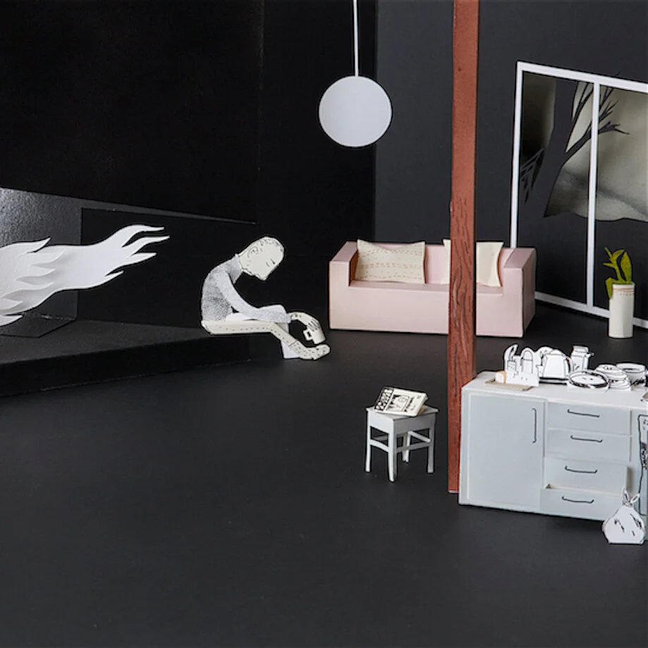
The cut paper illustrations (like in My Father's Arms Are a Boat) are all hand made. I cut and fold and draw directly on paper. Using coloured paper or spray paint for color and ink for the line drawing. It is probably a bit like making props and scenery for a theatre.
Work in progress with cut paper pieces from My Father's Arms Are a Boat
Then I arrange the characters and props into scenes on a table one scene at a time. The scenes are quite small, about the same size as in the book. I set up photo lights and use a digital camera on a tripod. The camera is linked to my computer so I can shoot the scenes and get them directly into photoshop. I can make several arrangements of the scenes and try out what is best. I might do a little digital editing but not much. It is a fun way of working, but it takes time. Specially the composing and the photography.
Cover of Why Dogs Have Wet Noses, by Kenneth Steven, illustration by Oyvind Torster
In Why Dogs Have Wet Noses there is such a rich level of detail in your drawings. Did you get any direction from the author on these added details or were they purely from your imagination?
The details are my idea. I like to draw details and visual stories into the written story.
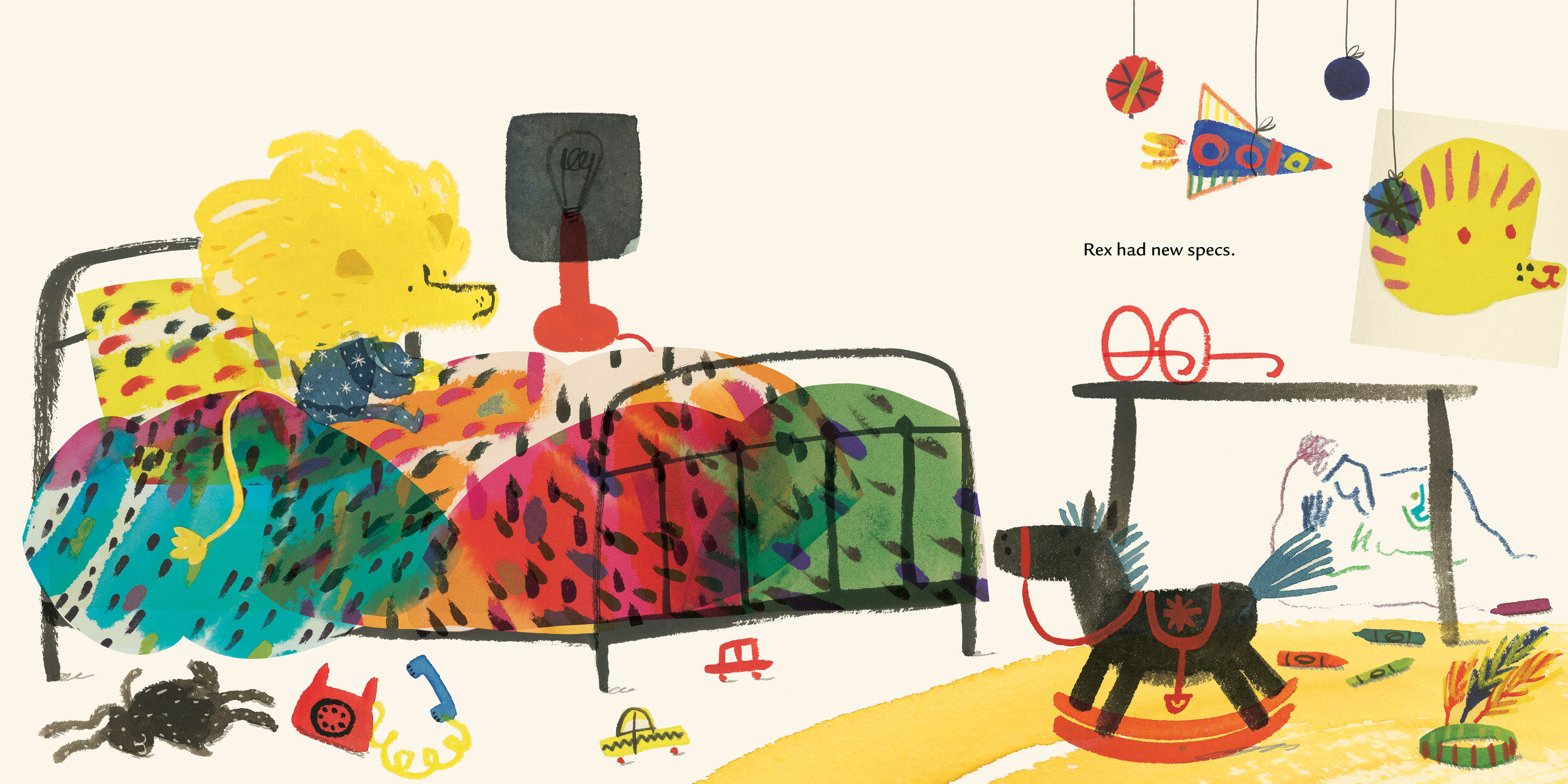
Interior spread from Why Dogs Have Wet Noses
Interior spread from Why Dogs Have Wet Noses
Interior spread from Why Dogs Have Wet Noses
Interior spread from Why Dogs Have Wet Noses
Interior spread from Why Dogs Have Wet Noses
Cover of The Heartless Troll, Øyvind Torseter
In The Heartless Troll (out in September), the horse provides some cynical humor but much of the tale is quite dark. This story was loosely based on a Norwegian fairy tale. Do you feel that we sometimes underestimate a child's ability to understand and appreciate darker material?
Yes, I think we sometimes underestimate. Some of the Norwegian fairytales are quite dark and children are fascinated by them. They speak to the imagination. I think grown ups are a bit afraid of imagination. We want to be more rational.
Interior spread from The Heartless Troll, Øyvind Torseter
Interior spread from The Heartless Troll, Øyvind Torseter
From back cover of The Heartless Troll
What is a favorite book from childhood? Did it impact your style as an artist?
I liked the folk tales of Asbjørnsen and Moe (The Heartless Troll is based on one of them). In Norway we all hear them as children and they speak to the imagination. I like that they can be interpreted in so many different ways.
I also liked cartoons a lot, I think that was an important influence to become an illustrator.
Thank you for sharing your creative approach and your work with our readers.
A selection of Torseter’s work
For more on Øyvind Torseter:
All images used with permission from Øyvind Torseter and Enchanted Lion Books.