
An Interview with Chris Van Dusen
Chris Van Dusen
May 12, 2017
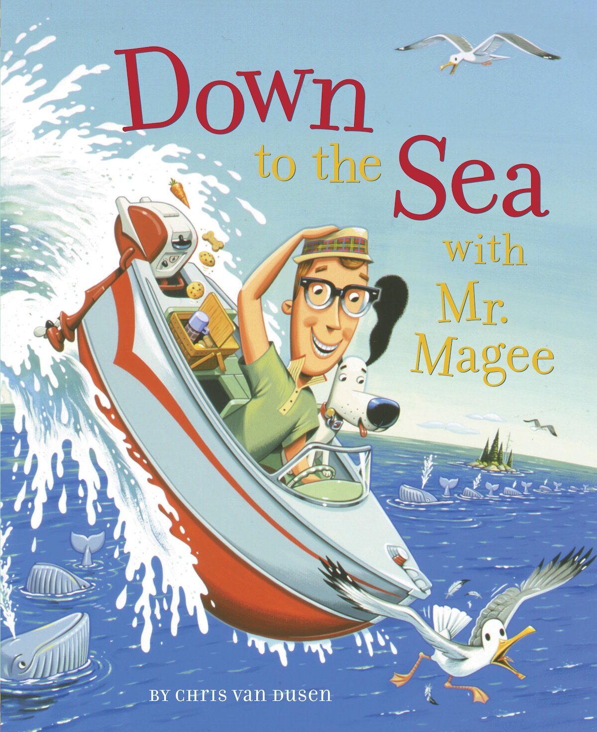
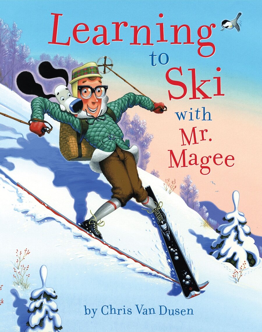
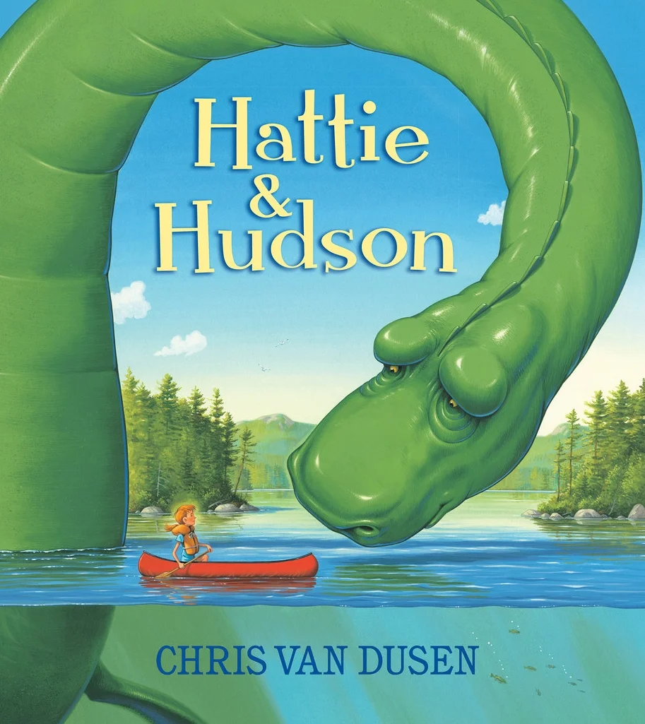
We interviewed Chris Van Dusen, acclaimed illustrator and author of children's picture books. His first book, Down to the Sea with Mr. Magee, which he both wrote and illustrated, launched a popular series, including A Camping Spree with Mr. Magee and Learning to Ski with Mr. Magee. With his signature rhyming texts and retro illustrations, he continued with another pair of books, If I Built a Car and If I Built a House. His latest book, Hattie & Hudson, is his first written in prose. He has also illustrated Mercy Watson, an early reader chapter book series, written by Kate DiCamillo. Van Dusen lives and works in Camden, Maine.

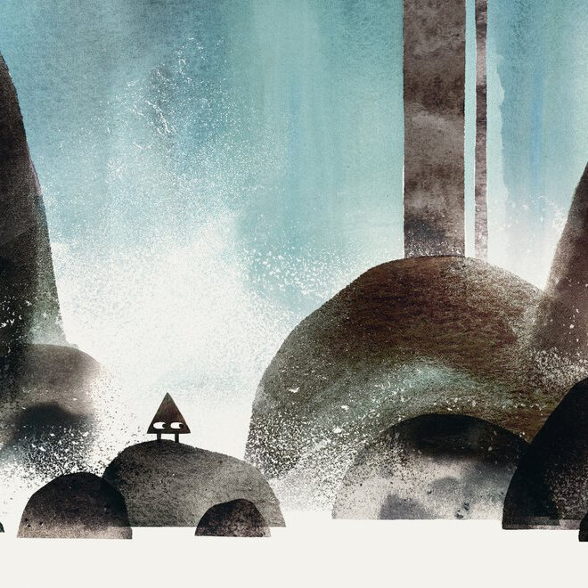
A Selection of Work

You work solely in gouache which, with the digital world these days, is still fairly unusual. What brought you to the decision for paint over the computer?
Basically, the short answer is: I don’t feel I have enough skill on the computer. An illustrator friend of mine said, “You can save a lot of time by using Photoshop, click in backgrounds, change colors. . . . ” I did buy Photoshop but I never ended up using it much. I decided I would just stick with gouache. I started out my illustration career with gouache. Even with my editorial work, before my picture books, I used it. It reproduces so well. The colors you paint are the colors you see when you print. With digital work, the colors can shift when they’re printed and that can be disappointing. That’s the first reason that I started with gouache. But also, over the years, I have continued to experiment with it. You can use it in so many different ways. It's a water-based paint so you can use a lot of water and get these big splashy backgrounds that are a wash and then you can use very little water and build up layers, and even spatter it with a toothbrush. It's a really fun paint to use, and it dries quickly. It’s been a real joy to work in gouache.
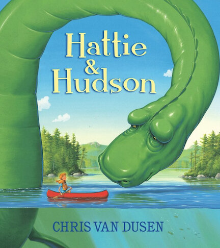
Cover of Hattie & Hudson, Chris Van Dusen
The way I usually describe it: gouache is opaque watercolor. There are certain colors you can pick for a wide area and it will dry completely flat, no brush strokes. You don’t see where you stopped or started, it’s just a complete, perfect field of that color. That’s really nice, especially when I’m trying to do bright, vibrant images that have a retro feel to them. I mix my paints on cheap plastic plates, that's what I use for palettes, and I will keep these same colors while I am working on a book. I just apply a little water to reuse the colors throughout the book. That keeps the color palette consistent throughout the illustrations. Usually, when I finish a book, I have about thirty to fifty plastic plates all over the studio. I will take a Sharpie marker and label the side of the plastic plate: skin tone Number One. It becomes, not paint-by-number exactly, but it helps the consistency of the color. I’m a stickler for consistency. I’m always afraid that someone will find something in my illustrations and say, “Hey, you know, this doesn’t match the last illustration.” So I try to keep track of those colors!
Interior spread from Hattie & Hudson, Chris Van Dusen
Perhaps people think your illustrations are done digitally because your colors are so vibrant, consistent and smooth. You don’t see the brush stroke or any other “tell” that would suggest watercolor or hand-painted.
Yes, especially kids! When I go to schools, they say, “Do you use a computer?” and when I say, “No,” they’re surprised. I try to bring some originals with me. Then I can show the actual paintings, especially for the older kids who can grasp the concept of an original painting. They say, “I don’t know how you did this!” and I tell them, “Well, it takes a lot of patience!” It usually takes me about two weeks to complete an illustration.

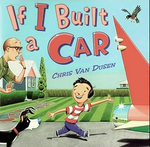
Cover of If I Built a Car, Chris Van Dusen
Do you still have most of your original paintings? Do you sell them to galleries?
Of course, all of the originals are returned back to me. I hold on to most of them. I do sell some of the Mercy Watson (by Kate DiCamillo) art because there’s so much of it. Sometimes I will donate a piece to a library or a charity auction. I just recently gave one of the originals from If I Built a Car to a friend of my son who got married. When this kid was younger, he would come over to play with my son, and he would always run up to the studio and ask what I was working on and so I would show him. After he grew up, a few years ago, he asked me, “Would you ever consider selling one of your originals?” I told him, yes, I might do that. A year later, I found out he was engaged and we were invited to the wedding. I thought it was the perfect opportunity to give him a piece of my work.
The illustrations from the books that I wrote I hold on to because once they’re gone, they’re gone. When they begin to take over the studio, I think I will have to send them off to a collection or start selling them. But for now, I’m hanging on to them.
How large are the illustration boards that you work on?
I tend to work at about 115%. It's just easier because some of the details are pretty small in the illustrations. If they’re up at 115%, I can paint those. The illustration board is 24 inches wide by 18 inches tall. I leave a white border around so the actual illustration is about 21.5 inches by 14.5 inches for a spread.
Since you work strictly on illustration board with water-based gouache, what happens if you make a mistake during the two-week process of creating the illustration? Is there a way to rescue it or do you have to start all over again?
Fortunately, I rarely mess up, but it does happen occasionally. I had to redo several illustrations from If I Built a Car, including the cover. When I'm painting an outdoor scene, I usually start with the background first. That's often the sky. Skies are tricky because I like to blend the color from a darker blue on top to a pale, almost yellow along the horizon. I have to work quickly with a large brush and a lot of water. I paint it very fast and then I literally cross my fingers and pace around the studio hoping that it dries right. Seriously! My first attempt at the cover of the If I Built a Car book I messed up the sky so I had to start over. It wasn't a big deal because it was the first thing I painted. If I make a mistake later in an illustration, gouache is pretty forgiving. I can either cover my flaws with a thicker coat of paint or soak off the affected area and repaint it. That's why I love to use gouache, it makes me look good!
Interior spread from Hattie & Hudson, Chris Van Dusen
We liked the typography used for your text in Hattie & Hudson. Do you specify the font or is that done by your book designer?
I work with Ann Stott, the art director at Candlewick, and she’s terrific. She has designed all the books I’ve worked on there and has such a great eye. I usually leave it up to her. With Hattie & Hudson though, I have a funny story. She had proposed a typeface for the cover title. I thought it was a little too cartoony. I told her I was going to find something a little more serious. She told me the website they use for fonts and suggested I look there. I went through all these fonts and found a few. She mocked them all up but I kept saying, “I don’t know if I like that one, I don’t know if I like this one . . . ” I didn't realize that one of the ones I was considering was the one she had proposed in the first place. She just said, “Okay, then we’ll go with that one,” and told me later it was the one we’d started out with!
Interior spread from Hattie & Hudson, Chris Van Dusen
Your previous books were all in verse and Hattie & Hudson was a departure with the story told in prose this time. Why the shift away from verse for this book?
This book actually started out like my other books, with a boy as the main character and I wrote it in rhyme, several times. It was a boy named Henry about the same age as Hattie is and the whole story was the same. But I was really struggling with the rhyme and I wrote it over and over again. My editor, Joan Powers at Candlewick, wasn’t sold on it yet and I wasn’t either. We liked the idea of the story but just the way it was told didn’t seem to quite fit. I remember I just woke up one morning and it was like an epiphany: this book is not supposed to be a rhyming book. That is why I’m having so much trouble with it. Joan suggested I try a few pages in prose and send it to her. I did and she immediately said, “This is the way this book should be.” I rewrote it but I found it difficult. I had never written in prose before. After writing in rhyme for so many years, you have that structure for a rhyme, it’s broken into stanzas, you maybe have three, maybe four stanzas per spread so you have those limits, even the syllable count. It’s all there. But suddenly to be given all the words in the world, no limits and all this freedom. It scared me. My first version was bare bones. I made it so simple and sparse. I realized I had cut out all the detail and description that livened up the story. It took a couple more times but finally, it came together. Writing prose was very difficult for me.
In design too, when there are no parameters, a blank slate without limits or a specific problem to solve, it can be paralyzing.
Yes, paralyzed is a good description. Even the length of a line, a sentence, could go on for twenty, twenty-five words! I had to get used to that. I was used to seven words per line. I had the story all written, in rhyme. I knew what the story was, but to translate from rhyme to prose, it was tricky.

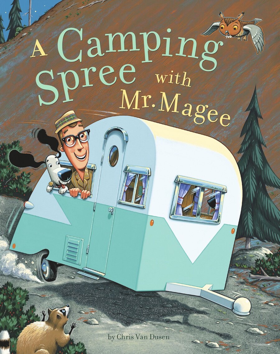
Cover of A Camping Spree with Mr. Magee, Chris Van Dusen
Do you think now, having had this experience, you’ll be inclined to objectively choose rhyme or prose for your future books?
Yes, I think so. The reason this book didn’t work in rhyme was because the story was so different from my other books. My other books have a fair amount of humor in them. The Mr. Magee books, my first books, he gets caught in these crazy predicaments so writing in rhyme seemed to lighten the whole thing up. It was a whimsical, crazy adventure. When I first wrote Hattie & Hudson, I tried to write it in rhyme. It felt like I was writing in a whimsical way about a serious subject. It was totally wrong. It didn’t work at all. But if I wrote another story that had a message or heartfelt story, I probably would go back to prose. And if I was going to write a crazy, madcap, silly story, I would go back to the rhyming.
Interior spread from A Camping Spree with Mr. Magee, Chris Van Dusen
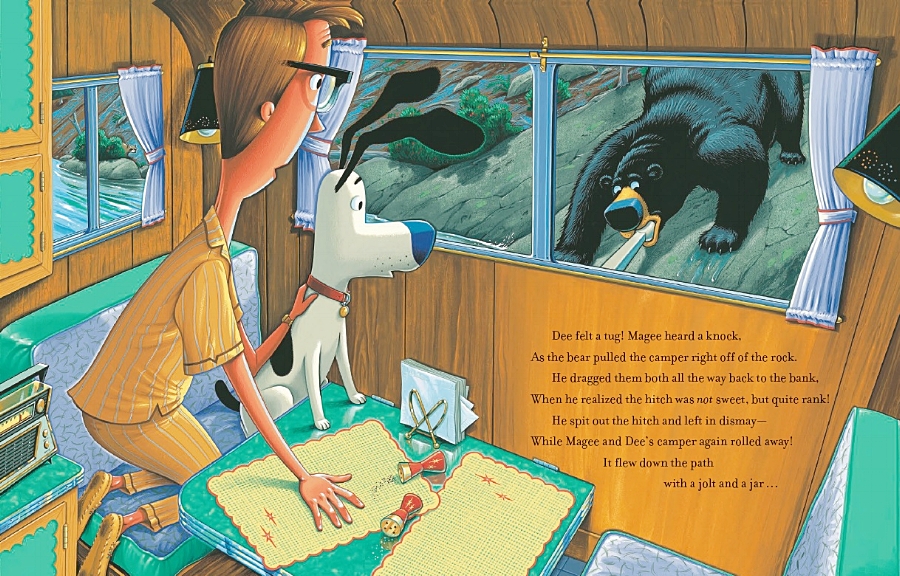
Interior spread from A Camping Spree with Mr. Magee, Chris Van Dusen
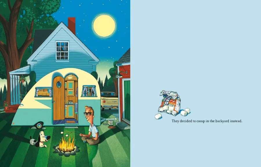
Interior spread from A Camping Spree with Mr. Magee, Chris Van Dusen
So the rhyming offers you a different tone.
Definitely. Like in The Circus Ship, it has some serious parts and funny parts. I wrote that in rhyme, but that one was a little different because the story took place in the 1830s and it had a historical feel to it. I was thinking of sea shanties, those old sailor songs, so you could almost sing the whole book with the way it’s written. I think the story would definitely dictate whether it would be rhyming or prose. I just had to find that out with this book. It took me a while.

Cover of The Circus Ship, Chris Van Dusen
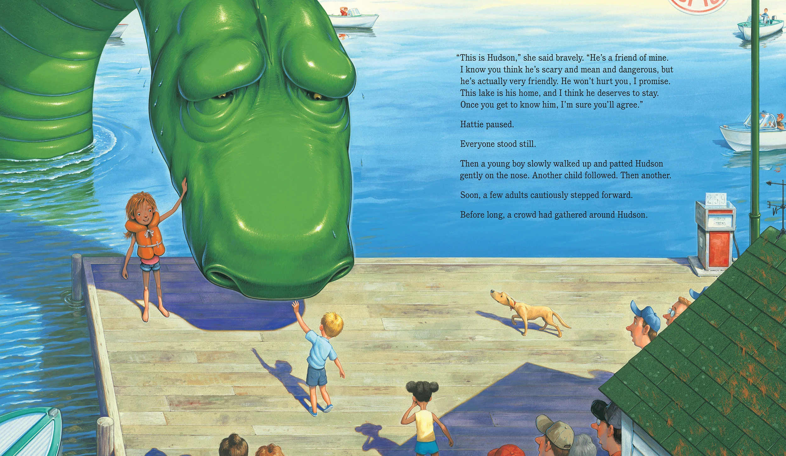
We love your message of acceptance and not judging by appearance in Hattie & Hudson. Was there something specific that led you to use that as a message in this book?
Yes. I learned this lesson in my own life. Before I did books, I used to work as an illustrator and art director at a small greeting card company. There was a guy that worked there in maintenance, married to one of my co-workers. When I first started there, I was scared to death of him. He was this great big, huge guy, not fat, but tall, with a full beard and long hair. He rode a motorcycle and wore black leather. I am such an Oxford-cloth shirt, chinos kind of guy and I can remember I was really intimidated. When I got to know him, he was just the sweetest guy I’d ever met. He was creative, an artist, he would do his own Christmas cards each year and he was a poet. He was a wonderful guy, just the biggest teddy bear you’d ever want to know in your life. It really taught me a lesson. So that’s what I was thinking about, Jim (his name was Jim) when I was coming up with the story. Not judging by appearance is a really important message.
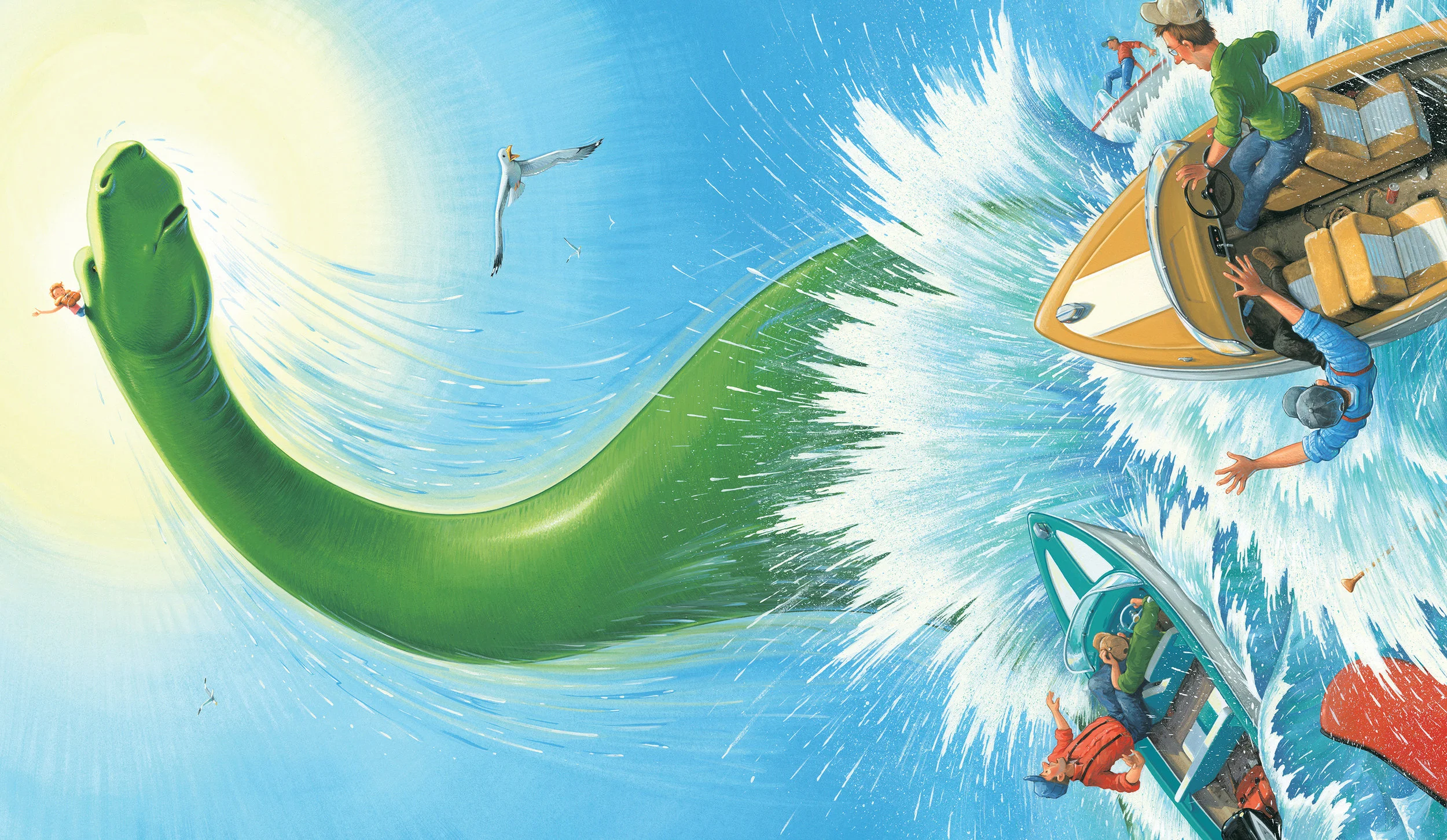
Interior spread from Hattie & Hudson, Chris Van Dusen
The strong character you created with Hattie could appeal to boys and Hudson could appeal to girls too. When you’re creating a book, do you find it necessary to develop characters that appeal to either boys or girls? Do you consider that?
I do think about that. One of the things I did change, with Hattie & Hudson, was to go from a boy named Henry to a girl named Hattie. I’d always wanted to do a story with a girl. In schools, girls were always asking me, “When you write another book, write a book with a girl as the main character.” So I knew I would eventually do that. But it started out with a boy and a monster. I thought the monster would appeal to boys and then if I could put a girl in there, the girls could relate to her. I thought this was the perfect book to do that, to introduce the female lead character. When I first started writing books, someone told me something that really bugged me: that girls will read books where a boy is the main character, but boys won’t read books where a girl is the main character. I’m not sure that’s true but it has haunted me. It’s probably why I’ve always put my main characters as a man or a boy. It may not even hold water anymore. So I may try more girl characters in my books. It’s fun.
Interior spread from Hattie & Hudson, Chris Van Dusen
It will be interesting for you to see how boys do respond to Hattie, being such a strong character and female lead.
Yes. She’s getting right out there, exploring. In fact, I started thinking that I wouldn’t do the things she does in this book! I wouldn’t be brave enough. Sneaking out at night, going down to the lake, encountering a giant monster . . . I wouldn’t have the guts to do that. I like the fact that she’s brave, that she’s taking all this on. She’s really driven by this potential friendship.
What were some of your favorite childhood books? Do you still own a copy of any of them?
Yes. I’ve told people that there were two big influences on my work. These were authors that I loved as a kid too. For writing, it was Dr. Seuss, I loved his books, still love his books. And I think that’s one of the reasons I started writing in rhyme. I loved the musicality of his books, the rhythm, how much fun they are to read, how much fun they are to hear. Dr. Seuss was a huge influence. The other one is Robert McCloskey, probably more for the illustrations. Robert McCloskey lived on an island off the coast of Maine for the second half of his life. His illustrations have such a sense of place. They have so much detail. His characters have such great expressions. His gestures are unbelievable. Just look at his drawings of the ducks in Make Way for Ducklings. I think he used lithographic crayons for those illustrations and the line work is so beautiful, the expressions, the characters. He blows me away. There was an exhibit at the Eric Carle Museum last year. It had some of his preliminary drawings. The sketches are so wonderful.

Cover of Down to the Sea with Mr. Magee, Chris Van Dusen
In Blueberries for Sal, there is a girl lead character who ends up facing down a giant bear, in Maine.
In my first book, Down to the Sea with Mr. Magee, there was a direct tribute to Robert McCloskey in one of the illustrations. I had Burt Dow, Deep-Water Man, which I think was the last book he did, about a guy who goes out fishing and he accidentally hooks a whale. There’s one illustration in Burt Dow where all the whales are steaming off and Burt is watching them go off into the distance. I did a very close image to that in Down to the Sea with Mr. Magee, when all the whales are heading out and he’s tipping his hat and waving.

Interior spread from Down to the Sea with Mr. Magee, Chris Van Dusen
It’s sort of your tribute to him.
Yes. The other books, If I Built a Car and If I Built a House, are more of a tribute to Dr. Seuss. They were based on a formula that Dr. Seuss used in a lot of his books. He starts with the main character who’s imagining what he would do in a certain situation and then each page becomes a story in itself, and it builds and builds to this big crescendo and ends with the realization that it is all in his imagination. He did this specifically in If I Ran the Zoo and If I Ran the Circus. It starts with a kid in the empty lot behind the grocery store and he imagines on each page all the different circus acts he would have and it gets more and more exciting and then he comes back to where he’s still standing in the vacant lot. I used that formula for If I Built a Car and If I Built a House. So many kids have told me those are their favorites.

Cover of If I Built a House, Chris Van Dusen
Do you keep any kind of an ongoing sketchbook?
You know, I don’t. I never really have. I know a lot of illustrators who do that. In fact, my wife gave me an art book that was about illustrators with pages from their sketchbooks. It was great fun to look through but I don't do that. I guess it's because I spend most of my days sitting at my drawing table, drawing all day long. I do keep pads of paper around the house, by my bedside, so if I come up with lines for a book or an idea, I’ll jot things down. There are scraps with bits of drawing and notes but I don’t keep an actual physical, sketchbook.
Do you have any upcoming picture book projects that you can share with our readers?
I am working on a book, Even Monsters Need to Sleep, written by Lisa Wheeler. It’s a two-book deal and the other one is called Even Monsters Go to School. I'm also in the process of writing two more books. It’s busy and it’s exciting!
Thanks so much for sharing your work and creative process.
A selection of Van Dusen’s work
For more on Chris Van Dusen:
All images used with permission from Chris Van Dusen.
Hattie & Hudson. © 2017 by Chris Van Dusen. Reproduced by permission of the publisher, Candlewick Press, Somerville, MA.